Skip to content
I’m Dhiraj Chouhan

Share this portfolio

← Back to Home Page

Masters’ UnionDesigning for Scale

Product Design Case Study

How I took Masters’ Union from a 20-page site to 150+ pages: an 8-finding audit, 12 traced design decisions, an atomic design system and a three-phase approval workflow.

  • Journey mapping
  • IA restructuring
  • Token-based DLS
  • EdTech
20 → 150+
Pages on one system
10+
Program pages shipped
70+
Events and 70+ campaigns
25%
Engagement lift
8
Designers led

/ Overview

One team, three connected problems

I joined Masters’ Union as one of its first designers, when the school was barely a year old, and stayed four years. I worked directly with founder Pratham Mittal, growing from UI/UX Designer to Senior, and went on to lead an 8-person design team.

The brief looked like a website. The real problem was that one small team had to ship 10+ programs, 150+ pages and 70+ events, plus 70+ marketing campaigns, without quality or brand falling apart. So I treated it as three connected problems: the system, the program page and the way decisions got approved.

View Website
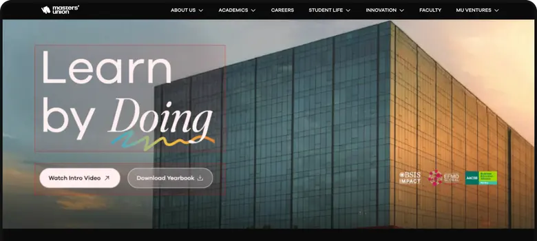
The Masters’ Union campus building at sunset

What I owned

  • Design roadmap and priorities
  • Research and page audit
  • Information architecture
  • Token-based design system, atom to organism
  • Approval workflow and developer handoff
  • Leading and reviewing 8 designers

The team

  • 1 × Researcher
  • 8 × Designers
  • 1 × Product Manager
  • 10+ × Marketer
  • 6+ × Engineers
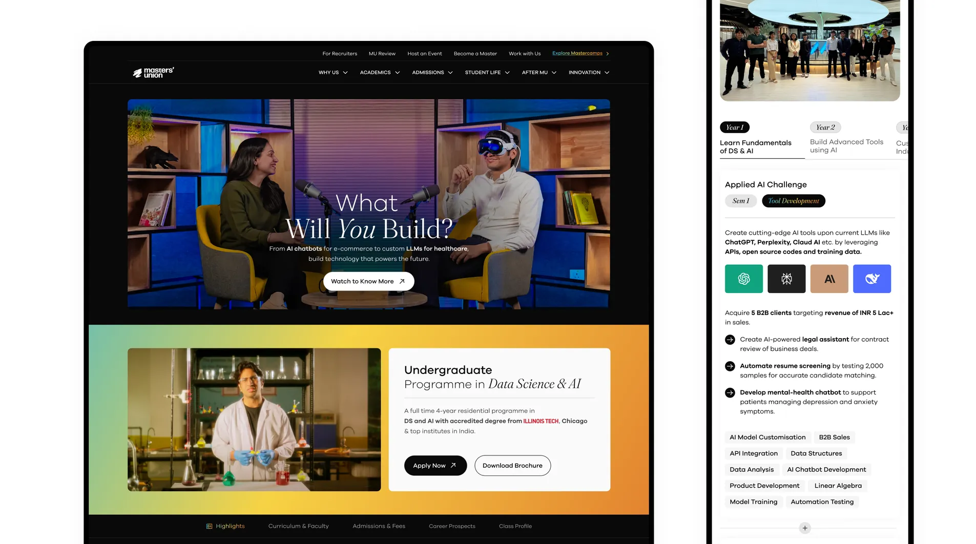
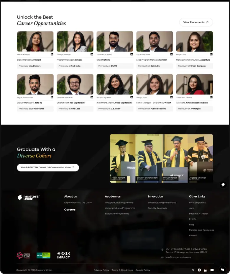
The redesigned Masters’ Union site on desktop and phone

3 problems

The Challenge

Rapid growth exposed three problems. Each one needed a different kind of answer.

  1. Scalability & Efficiency

    The site couldn’t handle the growing volume, creating bottlenecks in design and engineering.

    Decision

    Build the system before building more pages.

    What shipped

    A token-based design system with 16 component groups. One change updates every page.

  2. Engagement & Brand Alignment

    The design failed to reflect the premium brand positioning, resulting in poor user engagement.

    Decision

    Rebuild the program page as a decision journey, with proof before the ask.

    What shipped

    An 8-finding audit, then 12 numbered decisions on the new page.

  3. Process & Stakeholder Chaos

    Complex approval workflows and file management issues caused friction with C-level stakeholders.

    Decision

    Make approval a system, not a conversation.

    What shipped

    Three phases with one file per phase, one approver and a clear exit gate.

6 methods

Research

I used each method to settle a specific question, then traced what it changed.

MethodWithQuestionWhat it changed
Stakeholder interviewsFounders, managers, internal teamsWhat the business needed the site to doSet the three problems above
Feedback reviewMarketing and stakeholdersWhere publishing and approvals broke downShaped the three-phase workflow
Behaviour analysisSite user dataWhere users lost interest or dropped offSet audit priorities, such as the form (finding 6)
Competitive benchmarkingCompeting programsWhere the page fell short of the categoryRaised the bar for the visual language
Page auditExisting program pageWhat exactly was failing, section by section8 numbered findings
A/B testingLive usersWhether generic copy was doing its jobThree proof-led journeys (decision 7)

5 stages

Process

  1. Discovery & Research

    • Conducted interviews with founders, managers and internal teams to understand goals.
    • Collected feedback from Marketing and stakeholders.
    • Analyzed user behavior data and performed competitive benchmarking.

    Outcome: Clear understanding of key pain points and opportunities for growth.

  2. Information Architecture & Strategy

    • Redesigned the sitemap around user intent instead of internal structure.
    • Created intuitive user flows for seamless content navigation.
    • Prioritized mobile-first navigation for core users.

    Impact: Simplified discovery of programs and content, reducing user friction.

  3. UX/UI Design

    • Designed a premium visual language with clear typography and interactive prototypes.
    • Enabled self-service content updates in figma for internal teams.

    Impact: Improved brand perception and empowered teams to maintain content quickly.

  4. Collaboration & Execution

    • Coordinated design strategy with founders, marketing and engineering.
    • Streamlined daily workflows using Notion and Agile sprints.
    • Partnered with engineering for QA and smooth delivery.

    Impact: Reduced bottlenecks and improved project execution.

  5. Iteration & Evolution

    • Used user feedback and engagement metrics to identify areas for improvement.
    • Validated features with A/B testing.
    • Documented insights for future scalability.

    Outcome: Continuous enhancement of user experience and platform efficiency.

Before

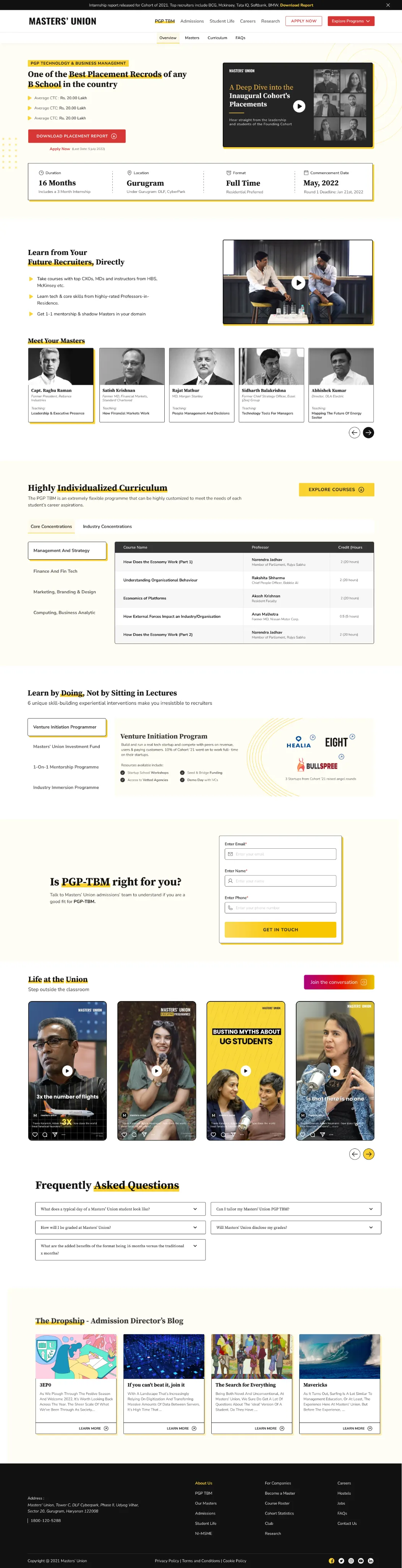
Audit: 8 findings

Each number on the old page matches a finding, tied to a specific section so every fix could be traced back.

The old Masters' Union program page, full length, with eight numbered findings

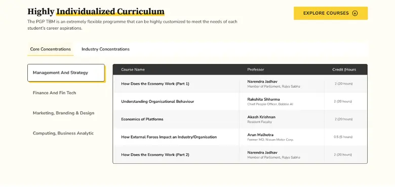
Finding 1Every program had equal weight in the menu

Findability

Finding Users could not easily reach a specific program. One all-in-one menu gave no hierarchy and no priority to special programs.

Direction A hierarchical navigation with global search, and visual emphasis on priority programs.

Finding 2The main action read as plain text

Action

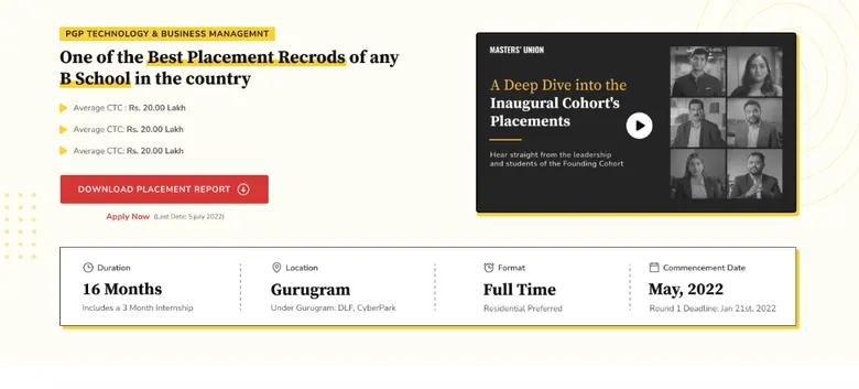
Finding “Download Placement Report” was the only button. “Apply Now” was plain text, so the page pushed the secondary goal.

Direction Rebuild the hierarchy around the primary goal, with stronger copy and video in the background.

Finding 3Highlights listed facts, not value

Proof

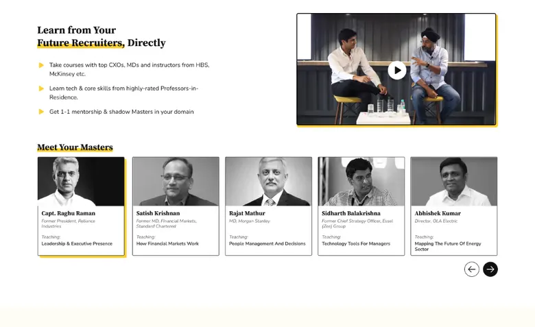
Finding The section gave blunt, minimal information. The journey and USP never came through.

Direction Tell the program’s value as a story, with key USPs, visuals and short snippets.

Finding 4Curriculum hid its own structure

Comprehension

Finding Tabs showed only course titles and professor names. No terms, and no split between in-class and out-of-class.

Direction Structure it by Term 1, 2 and 3, separate in-class from out-of-class, and add objectives and success stories.

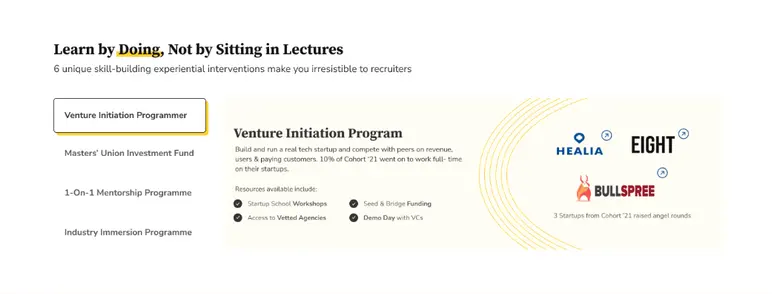
Finding 5“Learn by Doing” told instead of showed

Proof

Finding The school’s core promise was three static tabs. No context, no journey, no video of real outcomes.

Direction Three distinct sections, one per USP, with video snippets and student stories.

Finding 6The form gave no reason to finish

Action

Finding Many users dropped off before submitting. Nothing explained what the form was for or what came next.

Direction Give every section a hook and one clear CTA, so the next step is obvious.

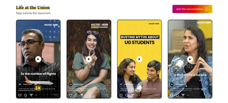
Finding 7Student life was scattered

Proof

Finding Social handles were spread across separate thumbnails, with no single way to experience campus life.

Finding 8Answers were hard to find

Findability

Finding Few questions, low discoverability, no search and no categories.

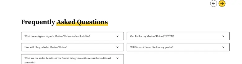
Direction A searchable, expandable FAQ grouped by Program, Admissions and Placements.

4 themes

Synthesis

Grouped together, the eight findings were four problems.

Findability

People could not get to the program or answer they came for.

Findings 1, 8
Decisions 6

Action

The page asked for the wrong thing, and gave no reason to continue.

Findings 2, 6
Decisions 1, 3, 5

Proof

The school’s strongest asset, real outcomes, was described and never shown.

Findings 3, 5, 7
Decisions 4, 7, 8, 9, 10

Comprehension

Dense information had no structure to read it by.

Findings 4

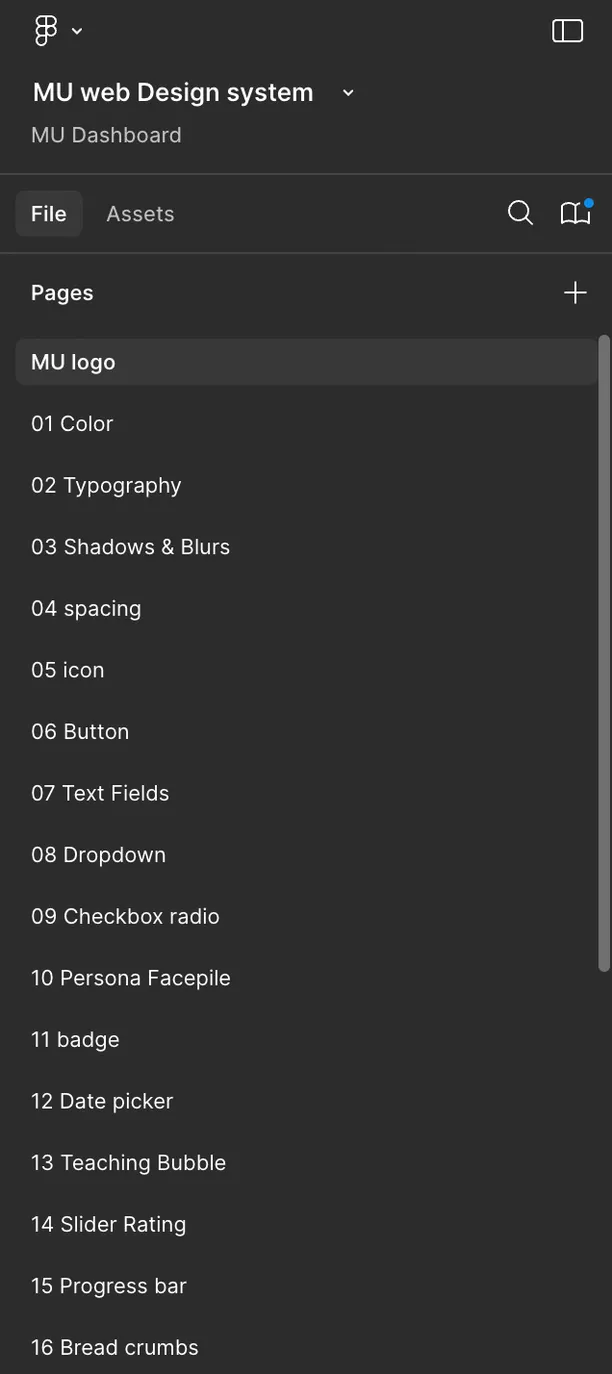
16 component groups

Design System

Built atom to organism, on tokens. One change, every page updates.

Atoms (Basic Elements)

  • 1 Color → All foundational color tokens
  • 2 Typography → Font families, scales, weights
  • 3 Shadows & Blurs → Depth system
  • 4 Spacing → Spacing tokens
  • 5 Icon → Iconography library

Molecules

  • 06 Button
  • 07 Text Fields
  • 08 Dropdown
  • 09 Checkbox / Radio
  • 10 Persona Facepile
  • 11 Badges
  • 12 Date Picker

Organisms

  • 13 Teaching Bubble
  • 14 Slider Rating
  • 15 Progress Bar
  • 16 Breadcrumbs
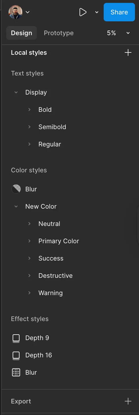
Figma styles panel listing the design tokens
Design Tokens: Colors, Typography, Shadows
Figma pages panel listing the component library
Components Library: Atoms → Molecules → Organisms

3 phases

Approval, as a system

Phase 1: Ideation & Design

Explore widely before anyone is asked to approve anything. Designers brainstorm, gather inspiration and produce multiple iterations for web and mobile.

Exit gate: one solid concept, moved to the Phase 2 file.

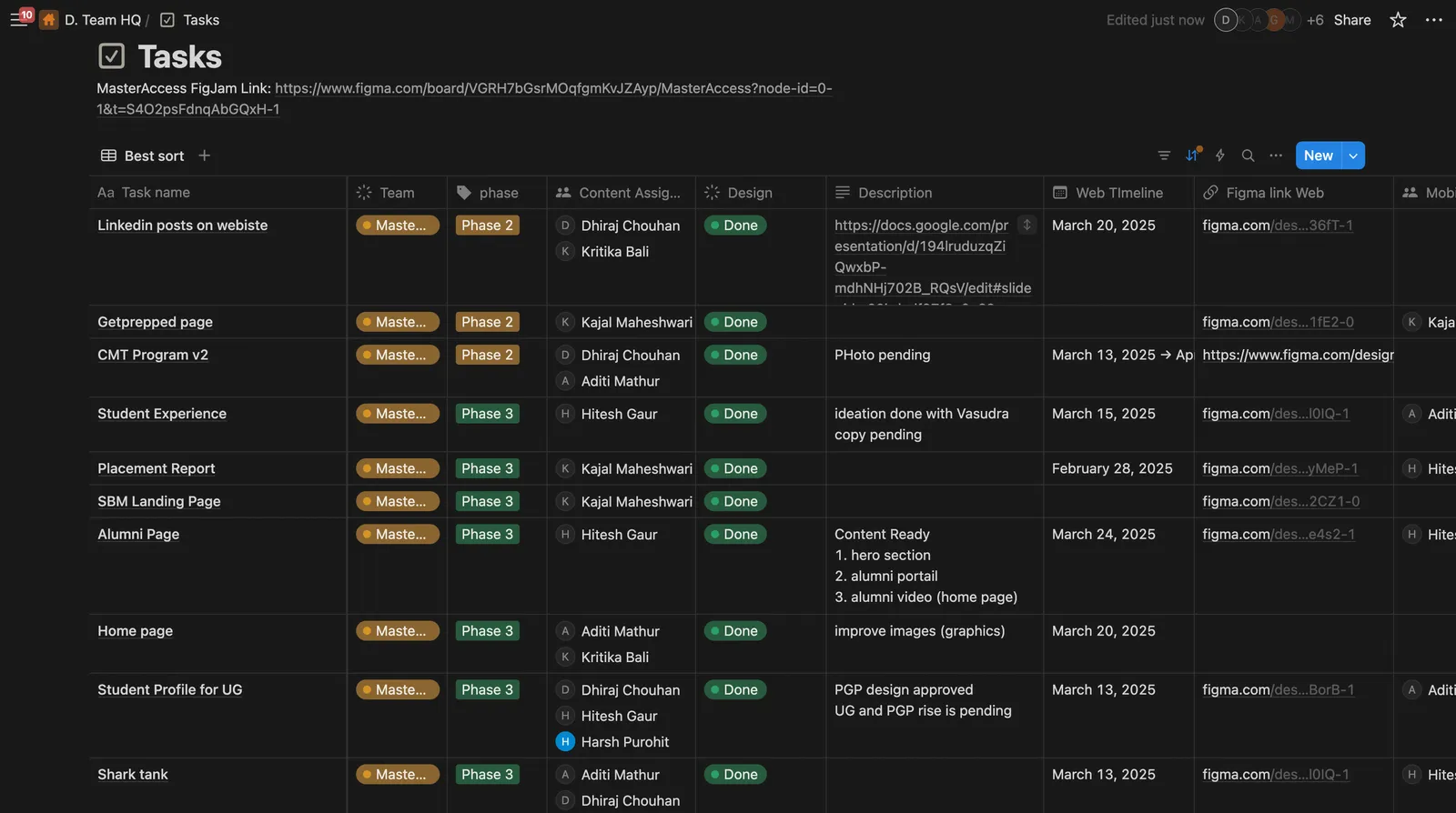
Notion task board tracking each page through the design phases
  1. Step 1

    Pratham shares the design brief, explaining what’s needed.

  2. Step 2

    Harsh, the designer, gathers the team or consults with the design head. They brainstorm ideas and discuss possible directions.

  3. Step 3

    Harsh starts collecting inspirations, analyzing competitor designs and sketching out ideas.

  4. Step 4

    Multiple design iterations are created-both for web and mobile views.

  5. Step 5

    Once a solid concept is ready, Harsh finalizes the Phase 1 design and moves it to Phase 2 for approval.

Phase 2: POC Approval & Iterations

One approver reviews the design in a dedicated file, so feedback lives in one place and is checked against the project’s vision before anything moves forward.

Exit gate: approved. Any change goes back to the Phase 1 file and is resubmitted, so the approved file is never edited directly.

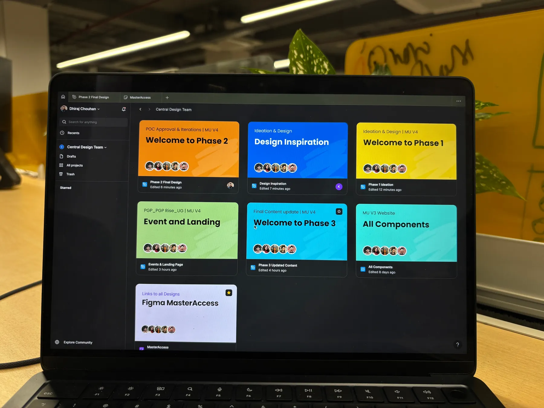
Laptop showing the team’s Figma workspace, with a file for each phase
  1. Step 1

    Harsh shares the design with Pratham in the Phase 2 file.

  2. Step 2

    Pratham carefully reviews it, ensuring it aligns with the project’s needs.

  3. Step 3

    There are two possible outcomes:

    Approved

    Revisions needed

  4. Step 4

    If changes were made, Harsh goes back to the Phase 1 file, completes the necessary edits and then resubmits the updated design in Phase 2 for re-approval.

  5. Step 5

    Once Pratham is satisfied, the design is officially approved and moves forward.

Phase 3: Final Content & Developer Handoff

All text, images and assets are finalized before development. Accuracy matters here, because any inconsistency reaches the final product.

Exit gate: an organized, annotated, export-ready file shared with engineering.

  1. Step 1

    Harsh (the designer) reviews the approved design and ensures that all text, images and assets are finalized.

  2. Step 2

    He checks if any placeholder content needs to be replaced with the final version.

  3. Step 3

    He ensures that mobile and web versions have the correct typography, spacing and image resolutions.

  4. Step 4

    The design is packaged and prepared with organized layers, developer annotations and export-ready assets.

  5. Step 5

    The final file is shared with the development team for implementation.

/ 35 pages

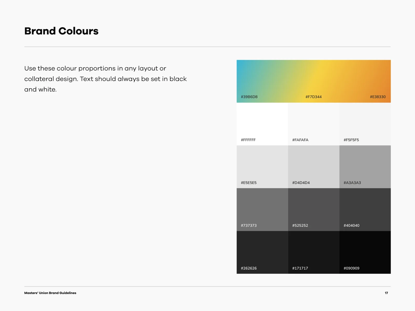
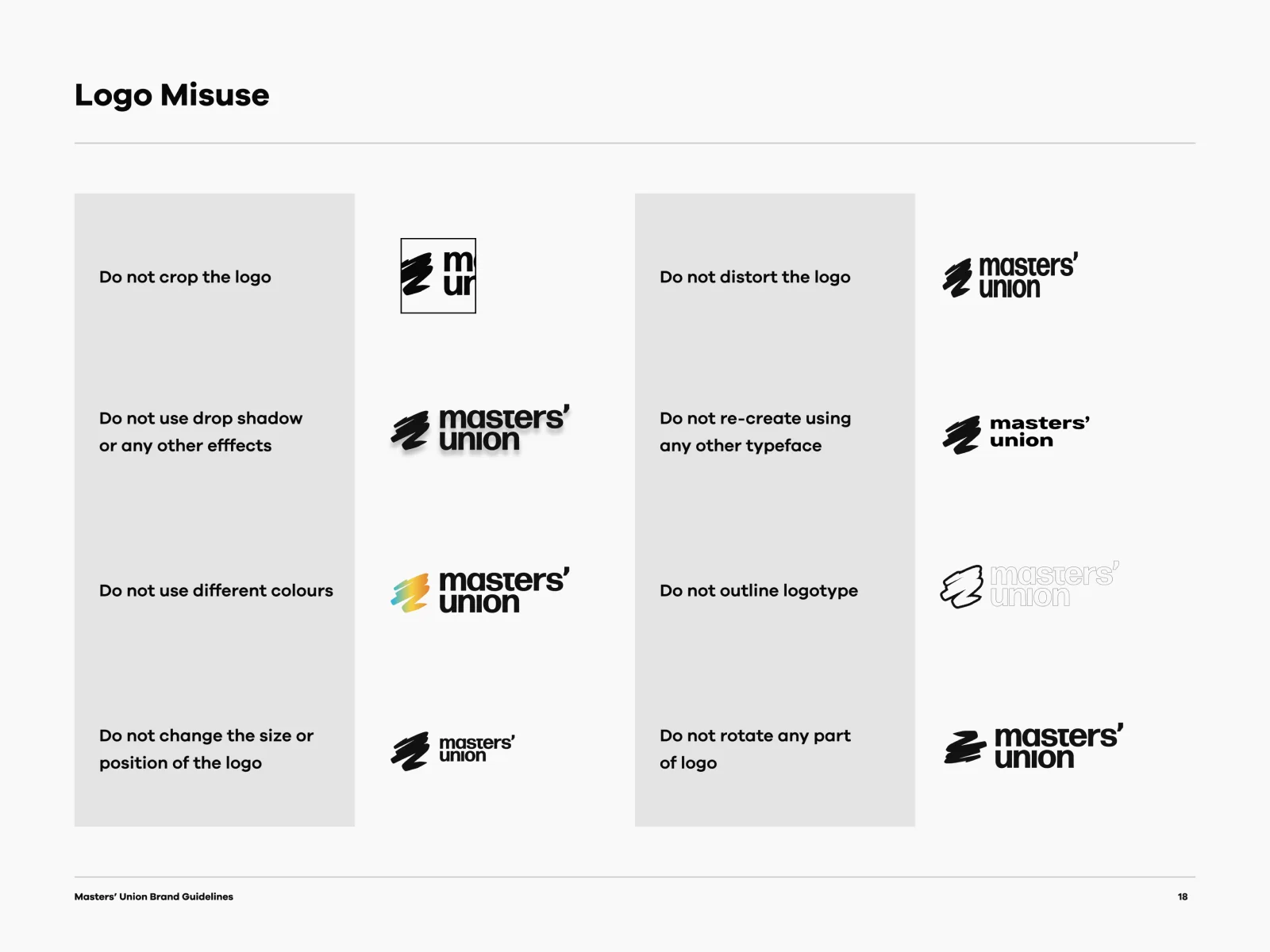
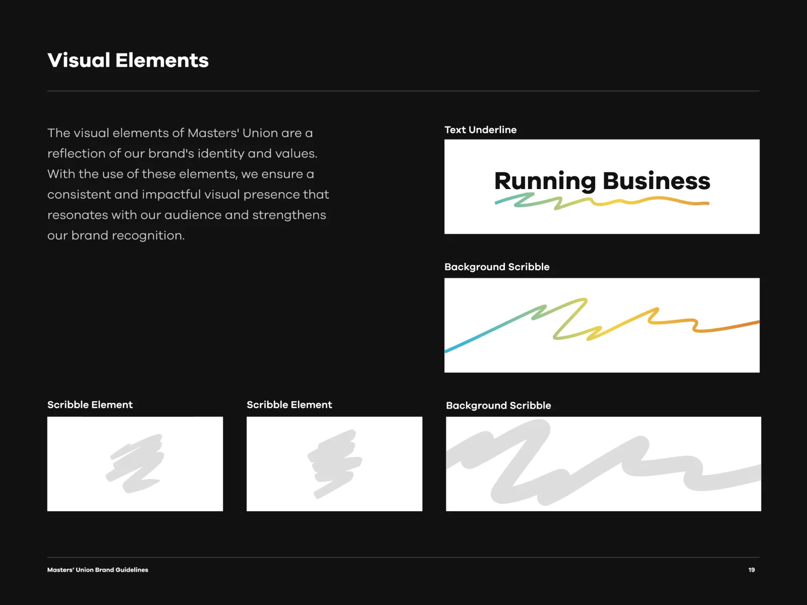
Brand guidelines, documented

Drag a page corner, swipe, or use the arrow keys.

Section 1
Defining our brand voice
Section 2
Logo
Section 3
Design elements
Section 4
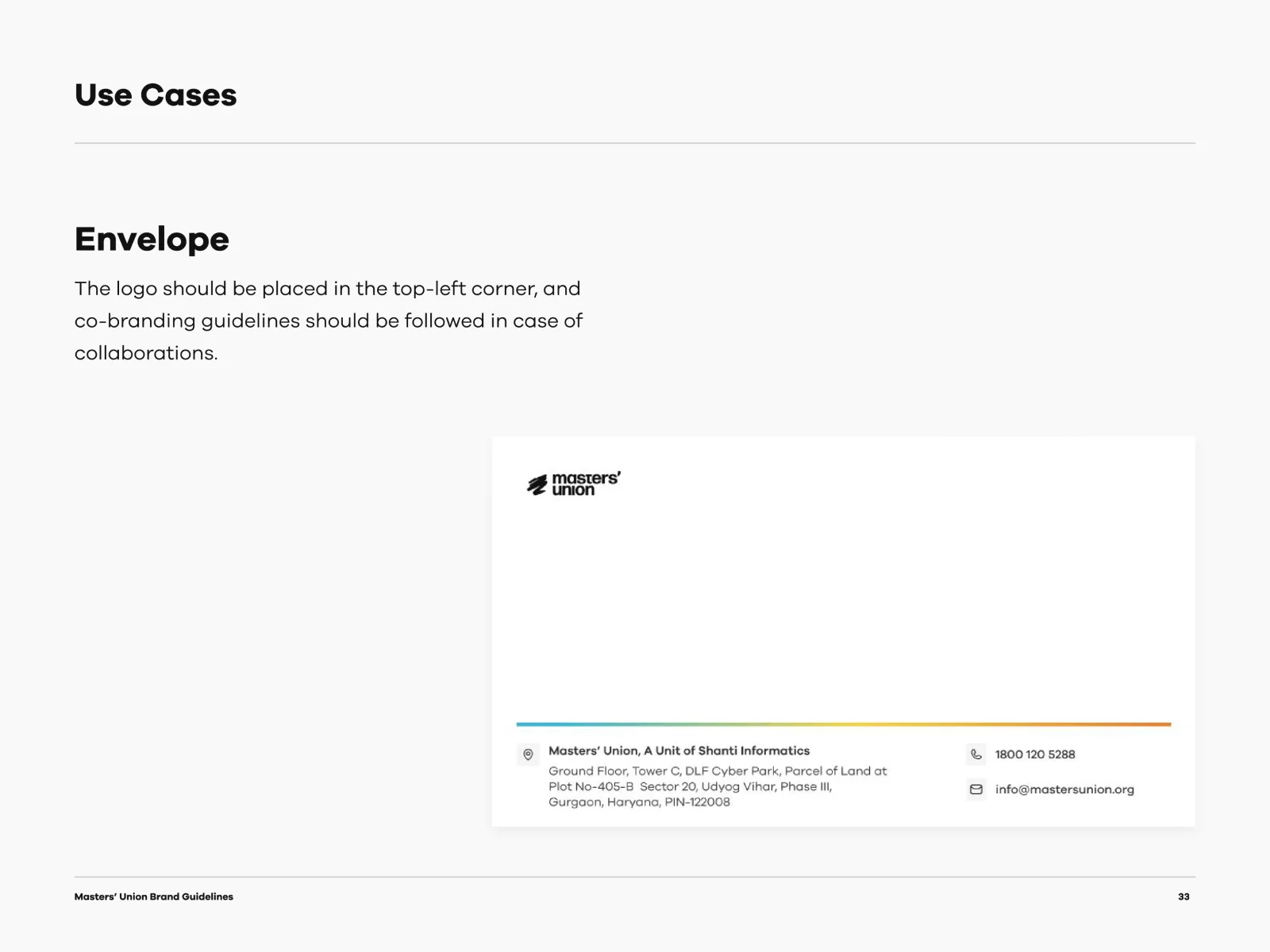
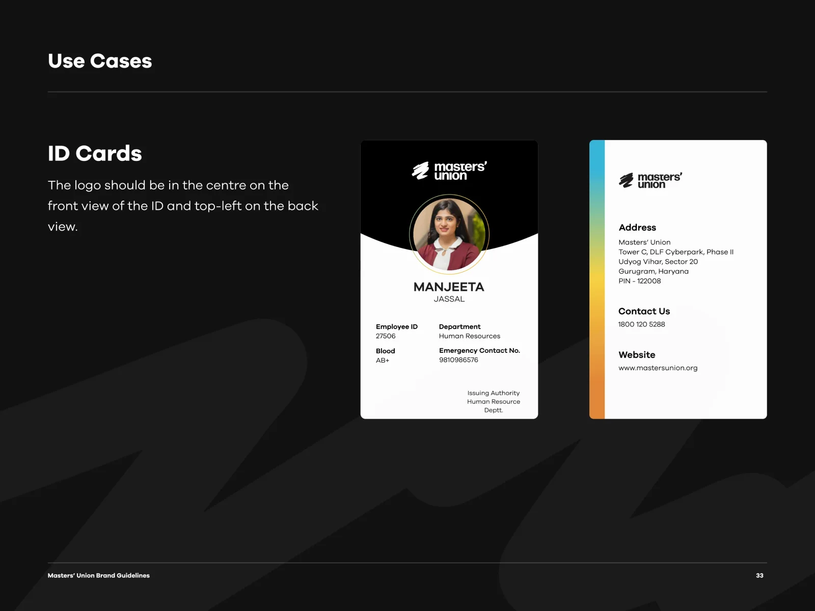
Logo placement and use cases
Masters’ Union brand guidelines, page 1
Masters’ Union brand guidelines, page 2
Masters’ Union brand guidelines, page 3
Masters’ Union brand guidelines, page 4
Masters’ Union brand guidelines, page 5
Masters’ Union brand guidelines, page 6
Masters’ Union brand guidelines, page 7
Masters’ Union brand guidelines, page 8
Masters’ Union brand guidelines, page 9
Masters’ Union brand guidelines, page 10
Masters’ Union brand guidelines, page 11
Masters’ Union brand guidelines, page 12
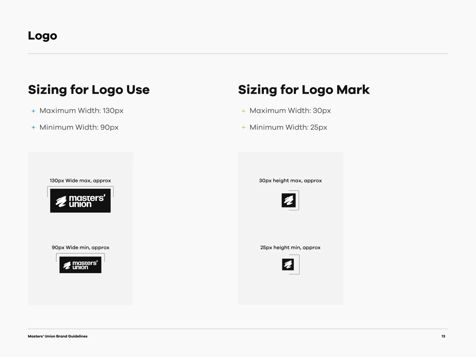
Masters’ Union brand guidelines, page 13
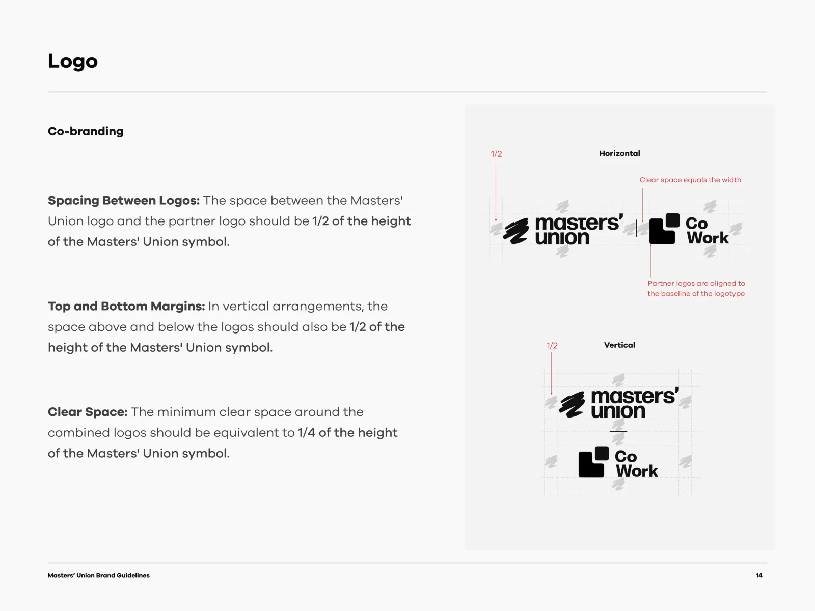
Masters’ Union brand guidelines, page 14
Masters’ Union brand guidelines, page 15
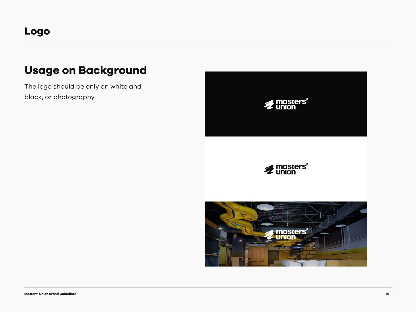
Masters’ Union brand guidelines, page 16
Masters’ Union brand guidelines, page 17
Masters’ Union brand guidelines, page 18
Masters’ Union brand guidelines, page 19
Masters’ Union brand guidelines, page 20
Masters’ Union brand guidelines, page 21
Masters’ Union brand guidelines, page 22
Masters’ Union brand guidelines, page 23
Masters’ Union brand guidelines, page 24
Masters’ Union brand guidelines, page 25
Masters’ Union brand guidelines, page 26
Masters’ Union brand guidelines, page 27
Masters’ Union brand guidelines, page 28
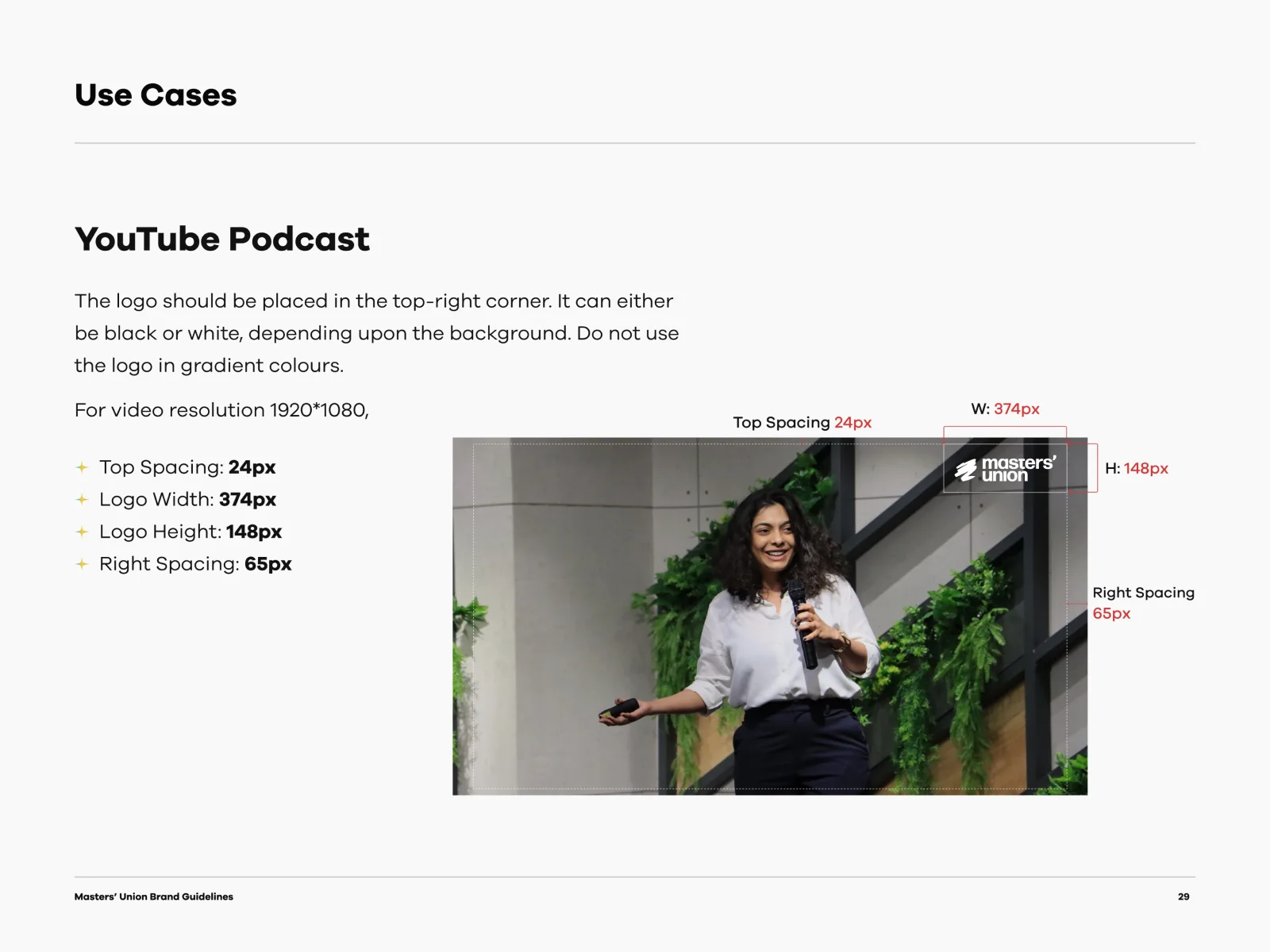
Masters’ Union brand guidelines, page 29
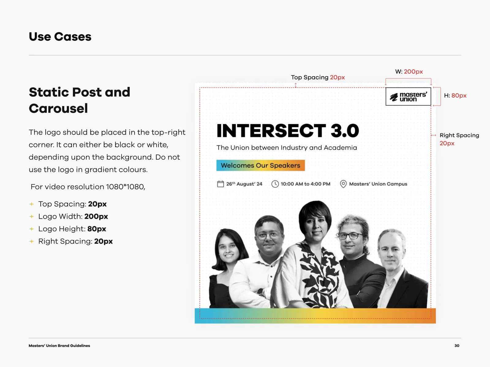
Masters’ Union brand guidelines, page 30
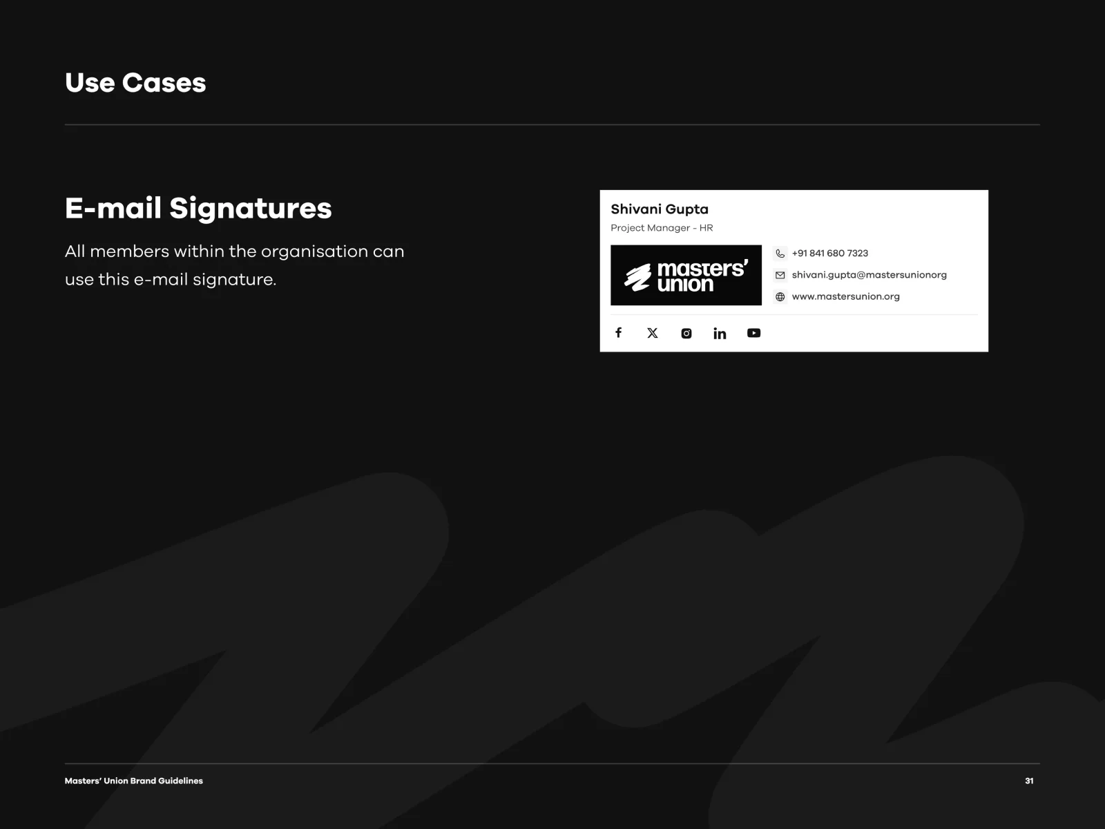
Masters’ Union brand guidelines, page 31
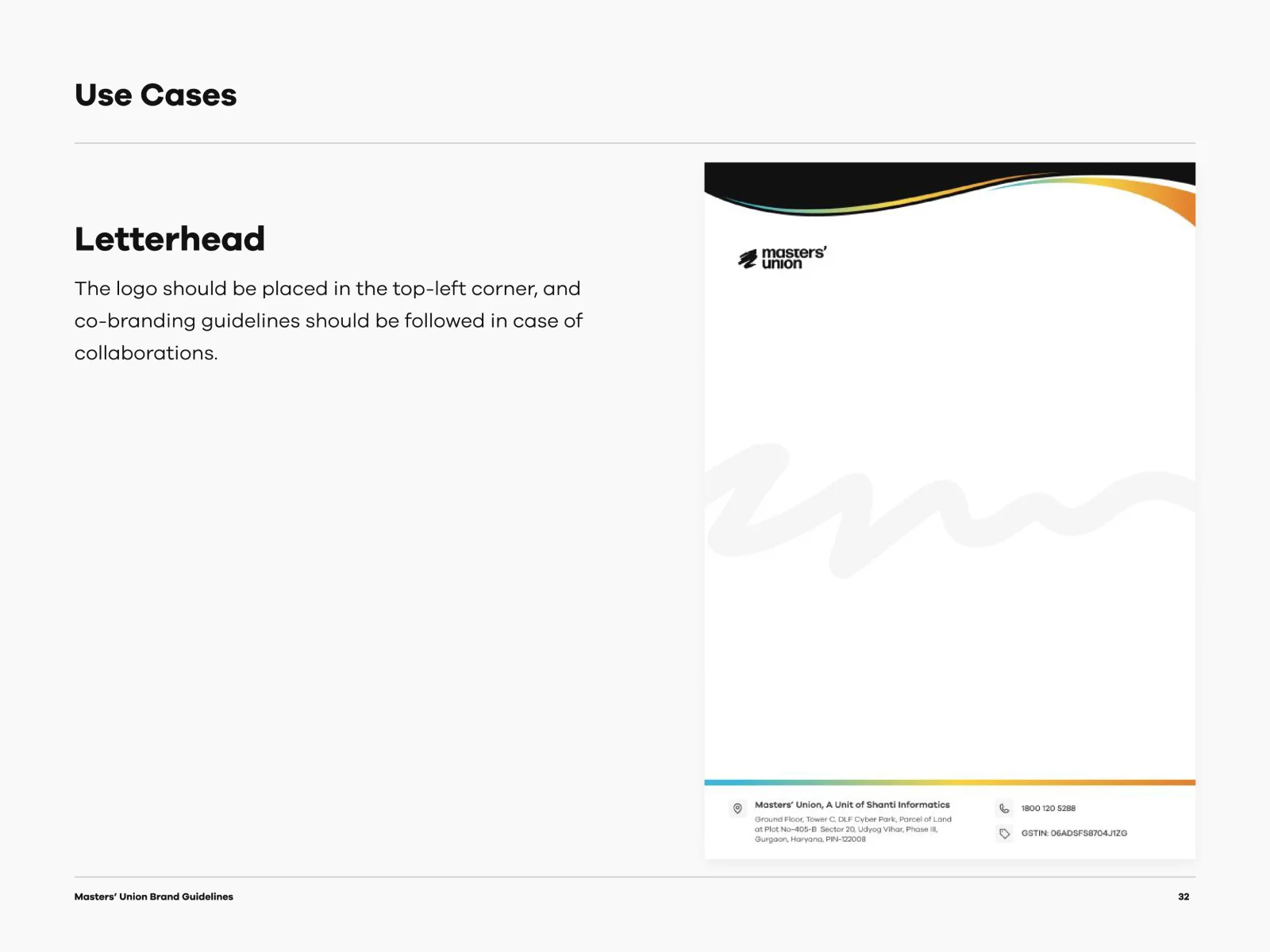
Masters’ Union brand guidelines, page 32
Masters’ Union brand guidelines, page 33
Masters’ Union brand guidelines, page 34
Masters’ Union brand guidelines, page 35
1 / 35
List the pages as text
  1. Brand Guidelines, cover
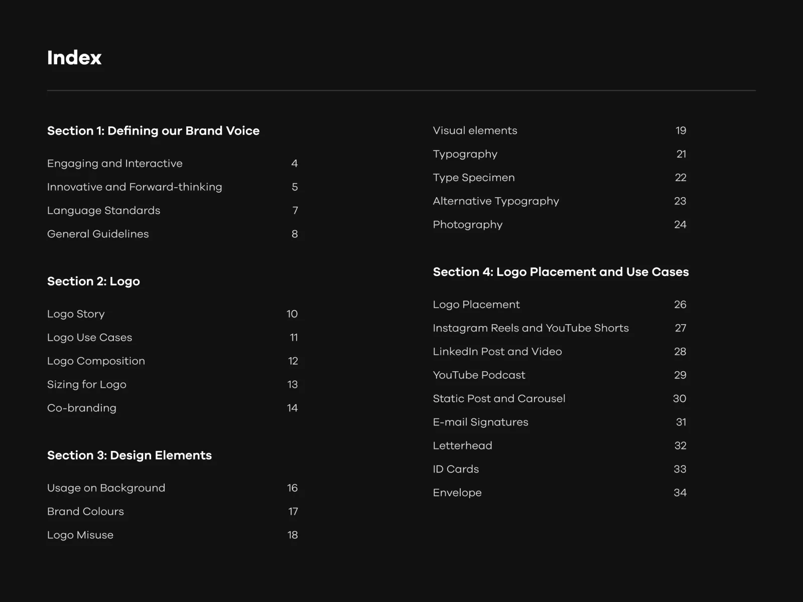
  2. Index
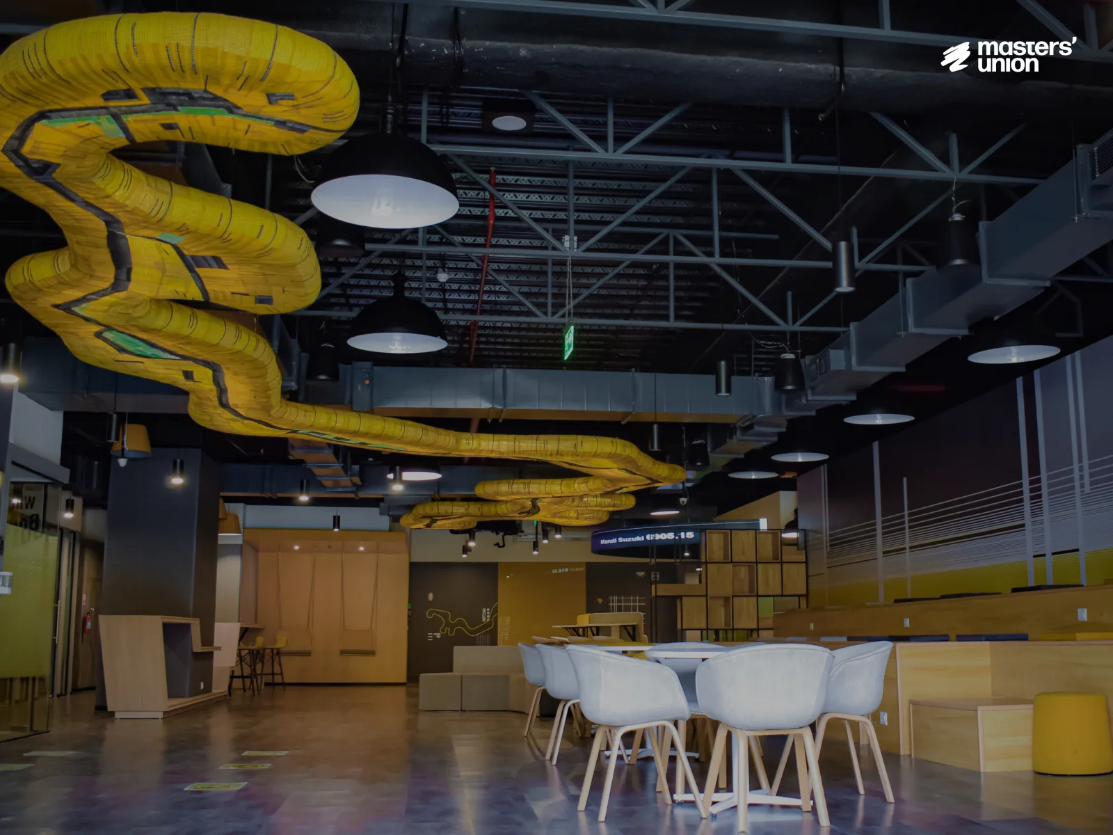
  3. Photo: the Masters’ Union campus
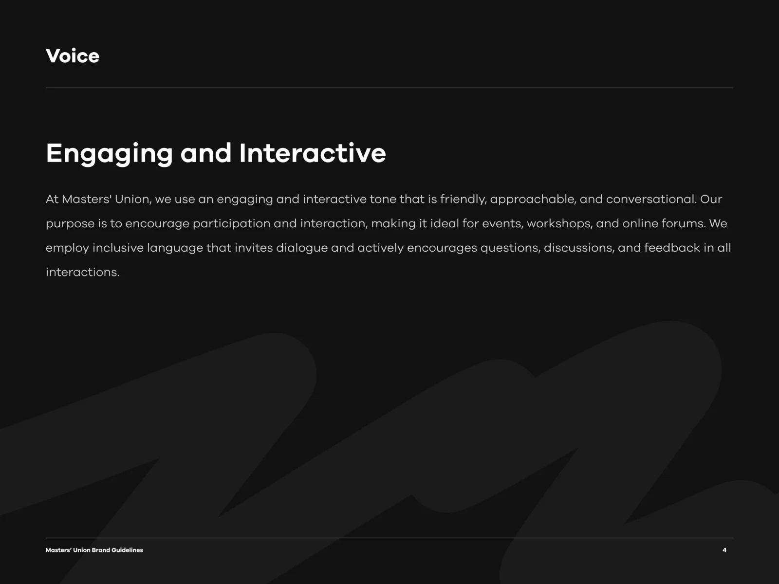
  4. Voice: engaging and interactive
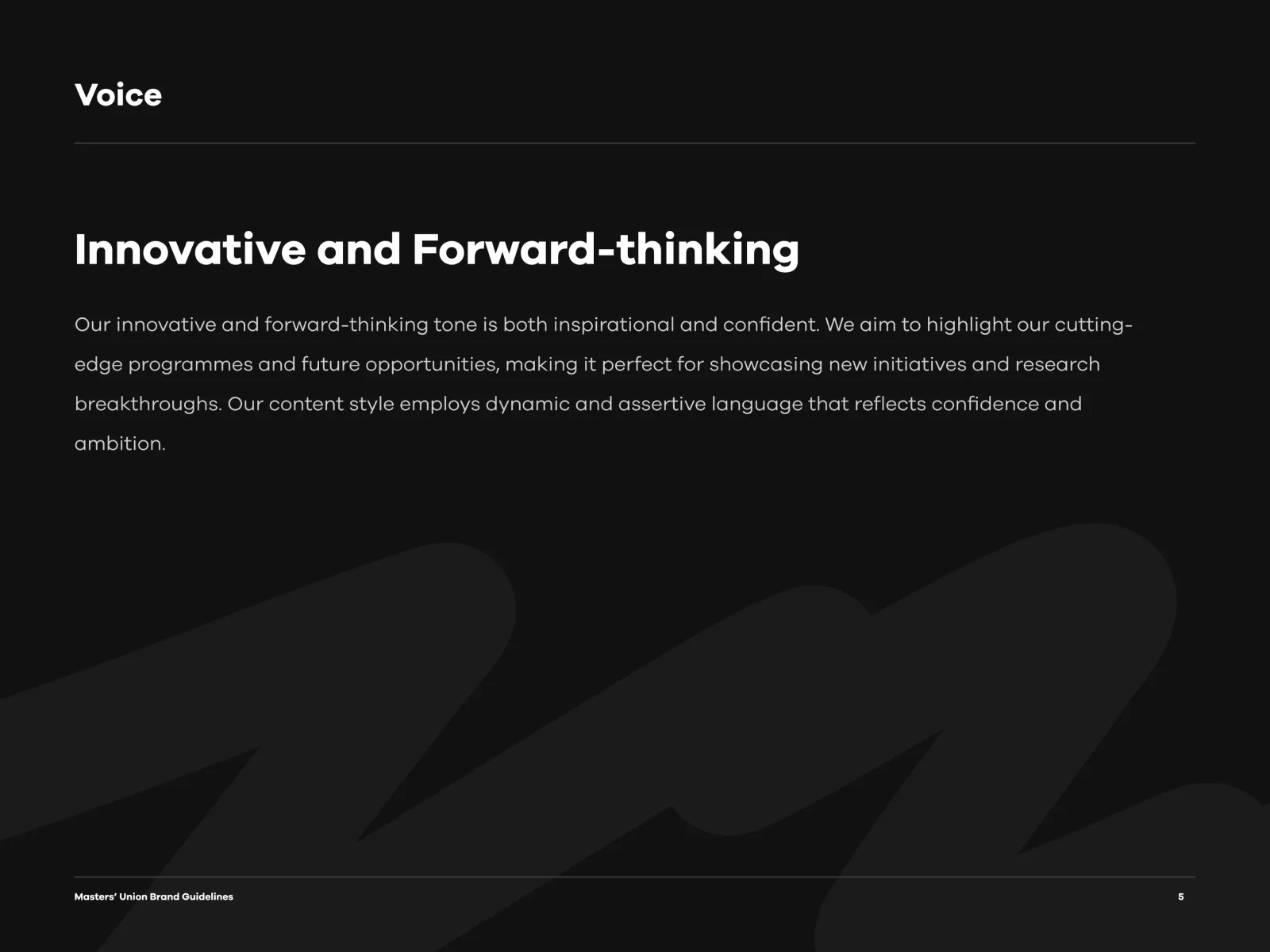
  5. Voice: innovative and forward-thinking
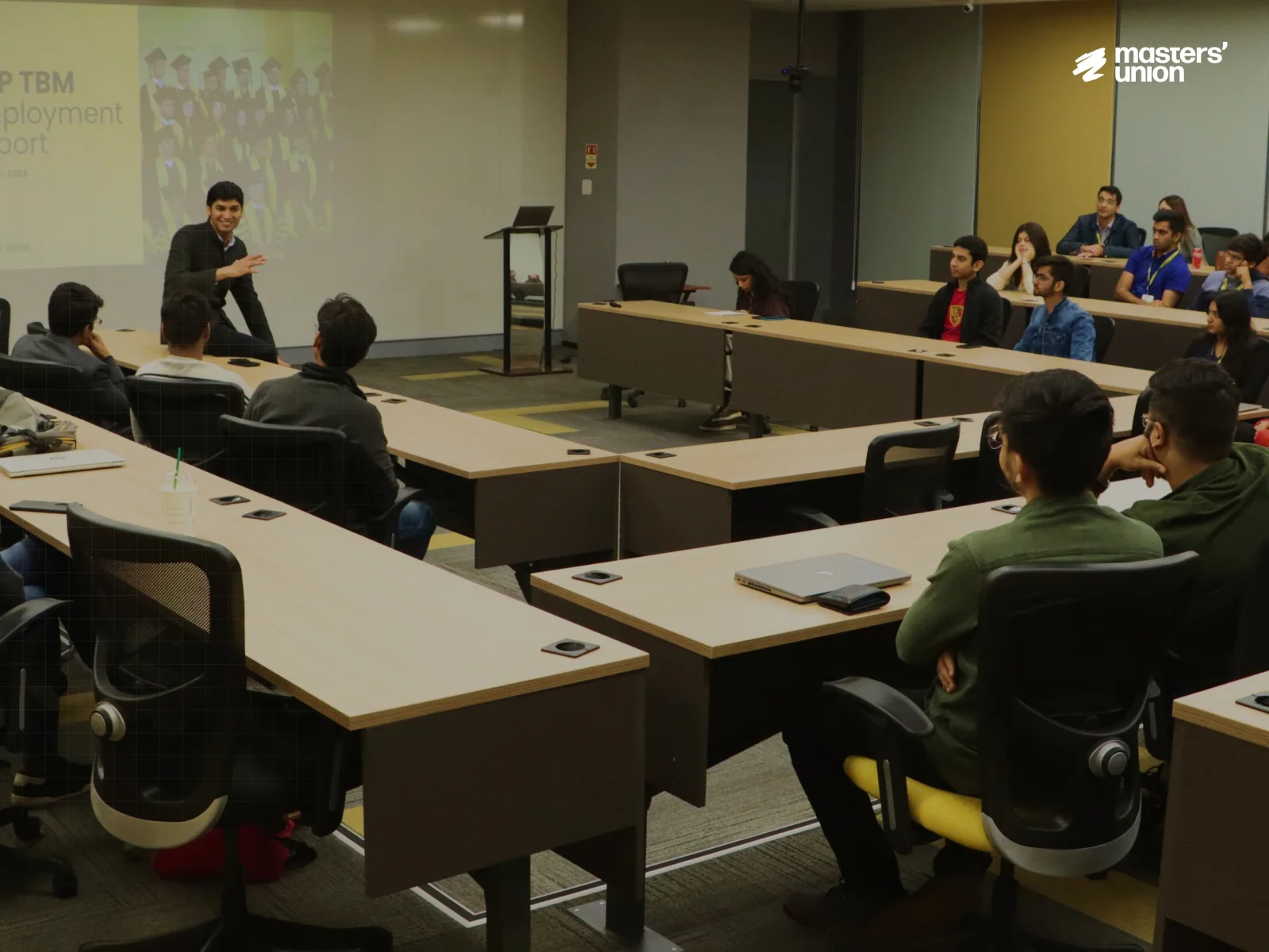
  6. Photo: a classroom session
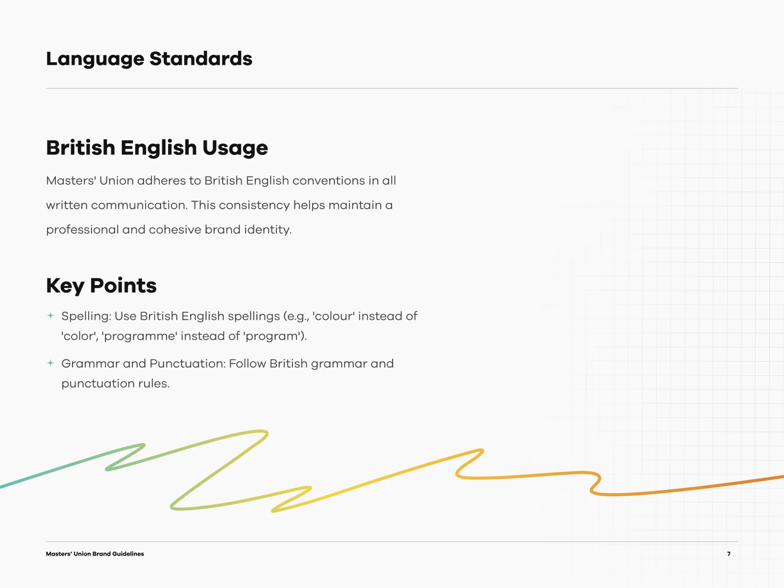
  7. Language standards: British English usage
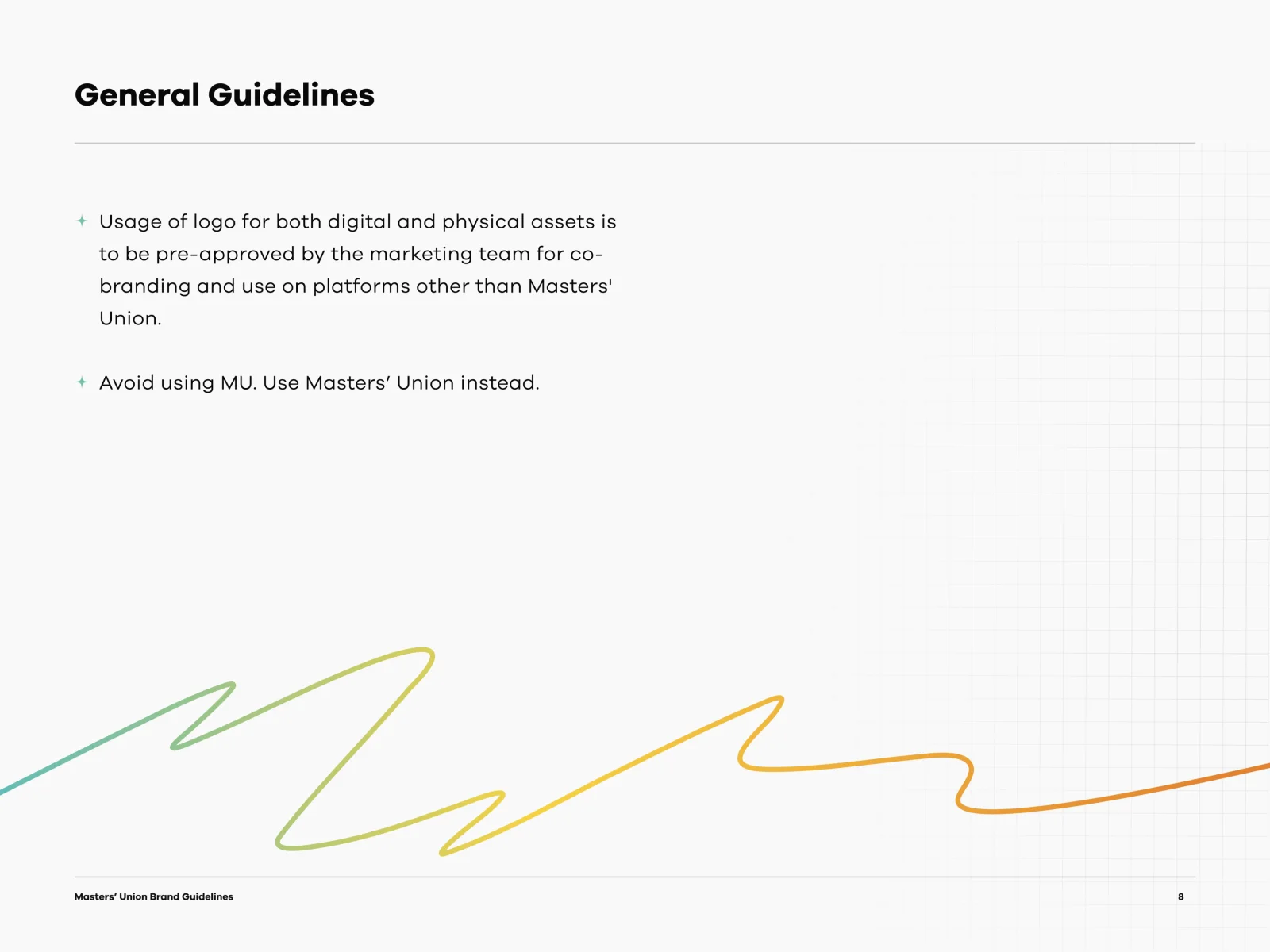
  8. General guidelines
  9. Photo: a classroom
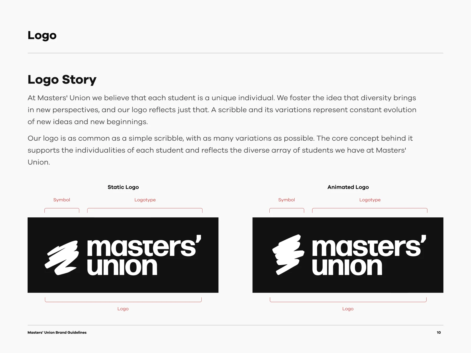
  10. Logo story
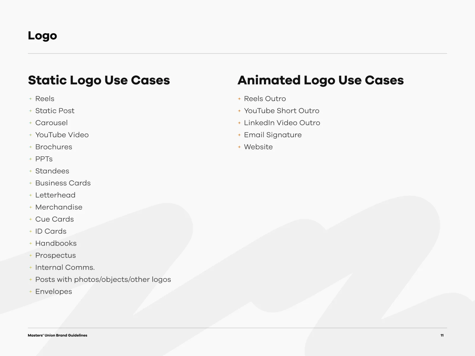
  11. Static and animated logo use cases
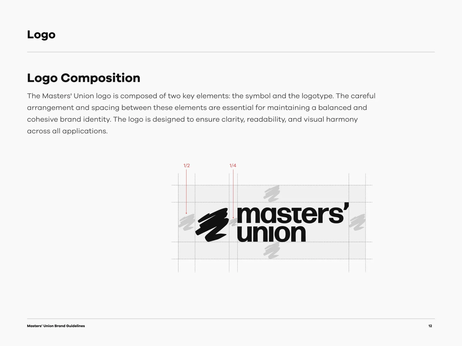
  12. Logo composition
  13. Sizing for logo use and logo mark
  14. Logo co-branding
  15. Photo: students in an auditorium
  16. Logo usage on background
  17. Brand colours
  18. Logo misuse
  19. Visual elements
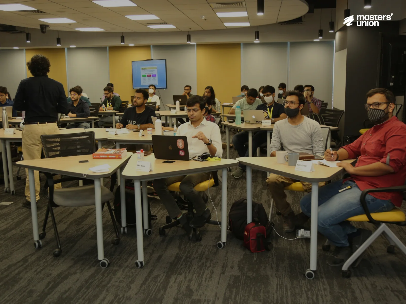
  20. Photo: students in a classroom
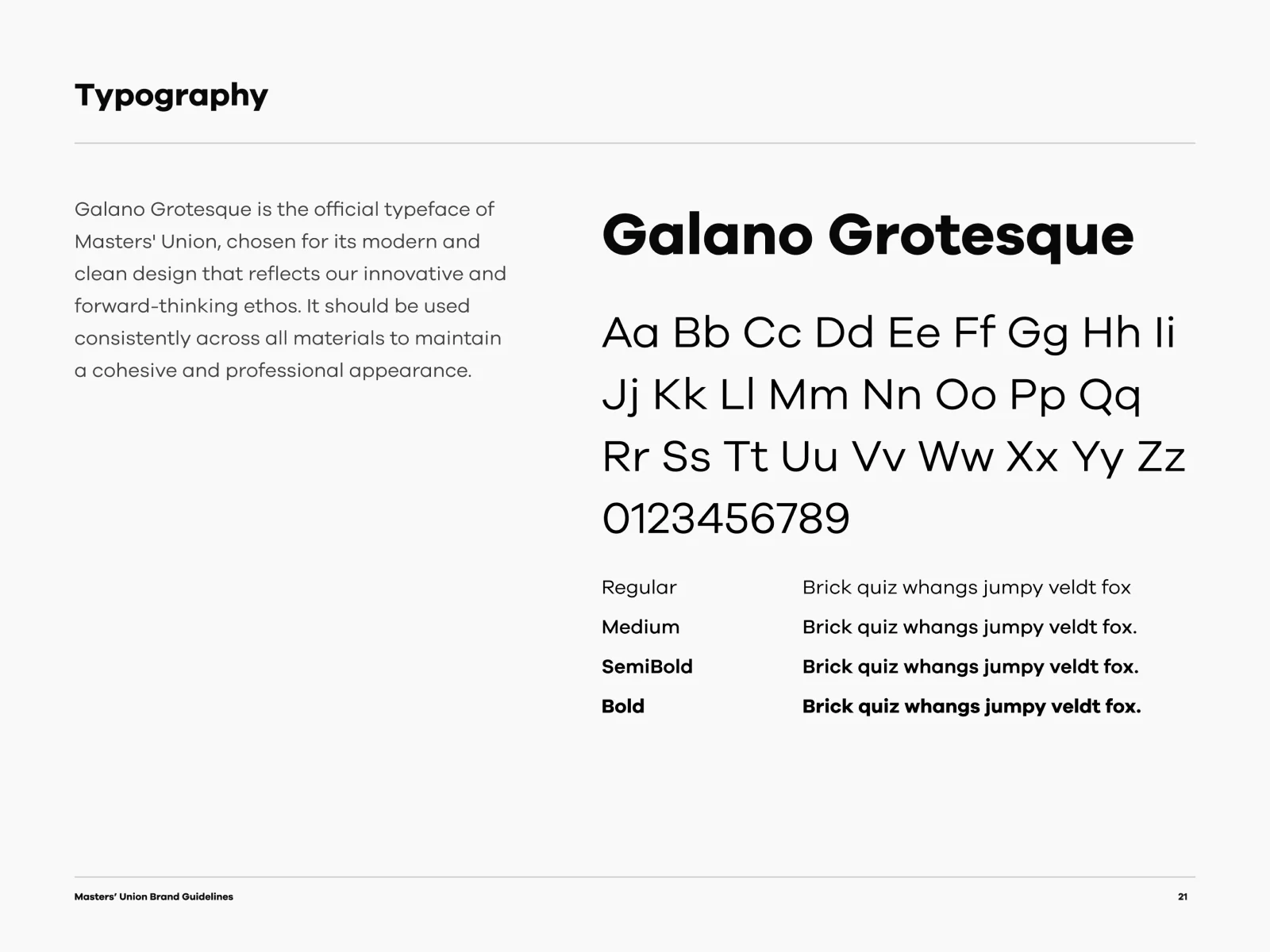
  21. Typography: Galano Grotesque
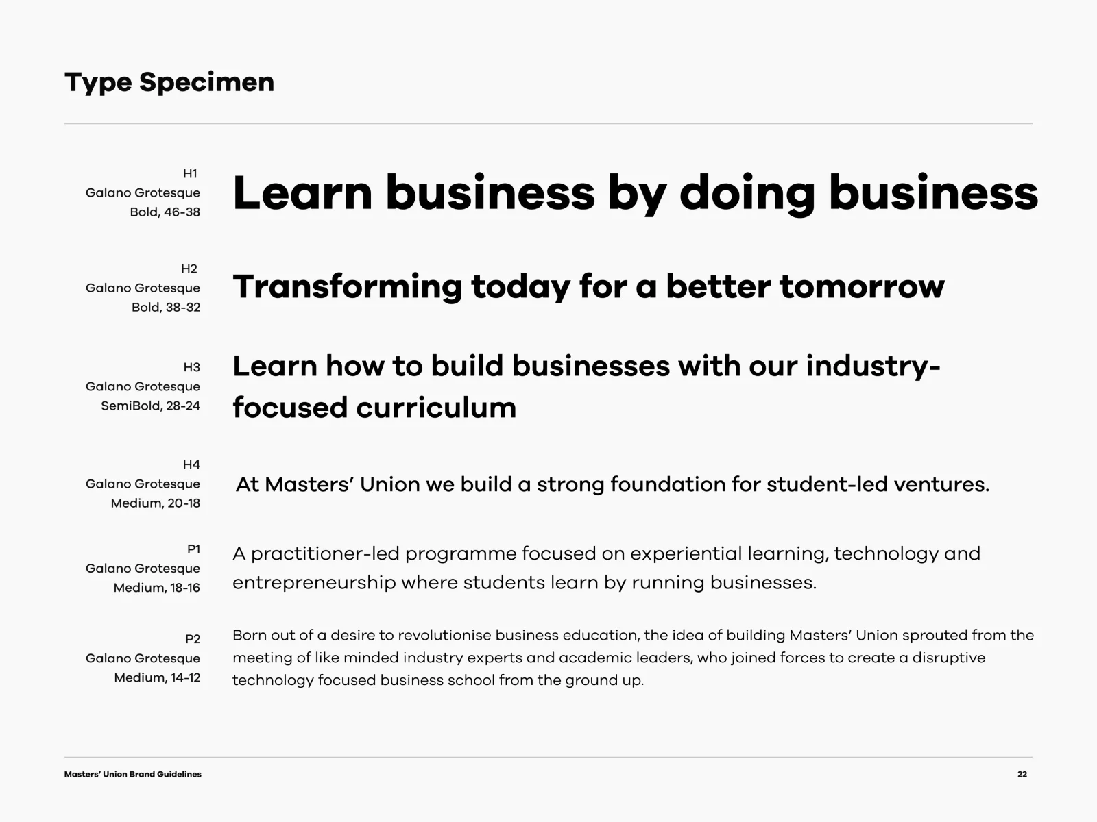
  22. Type specimen
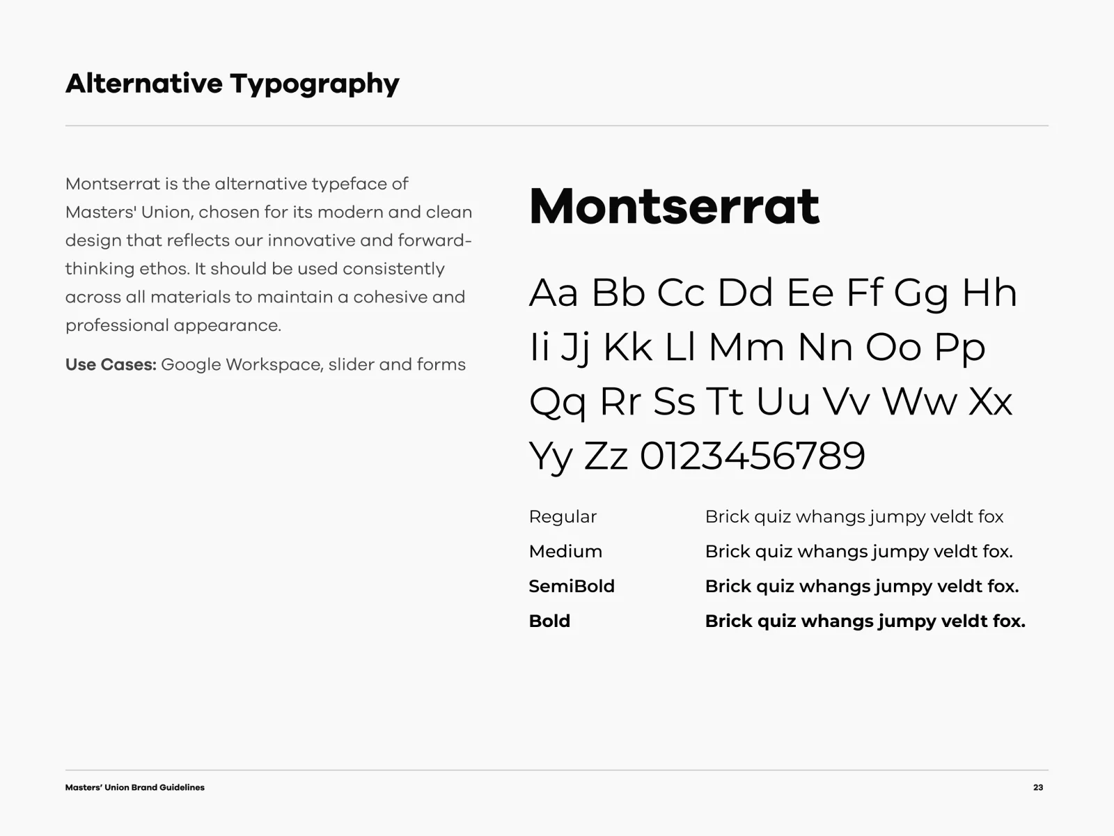
  23. Alternative typography: Montserrat
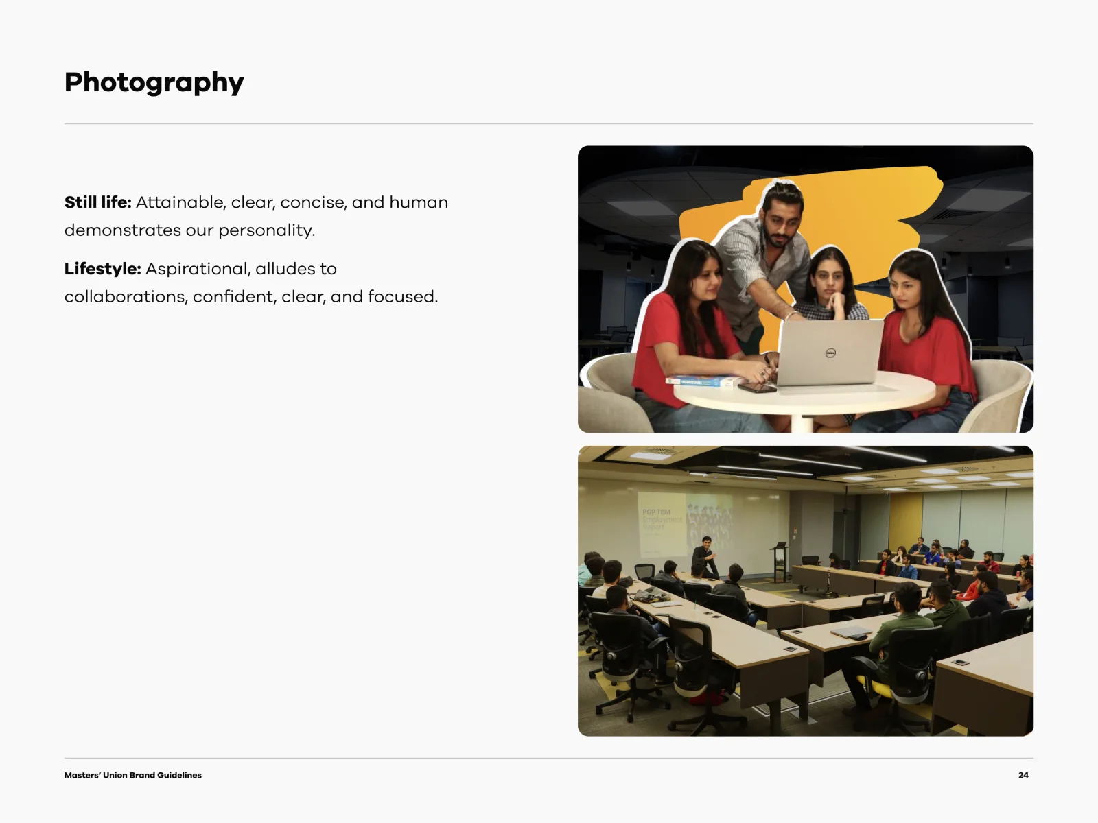
  24. Photography
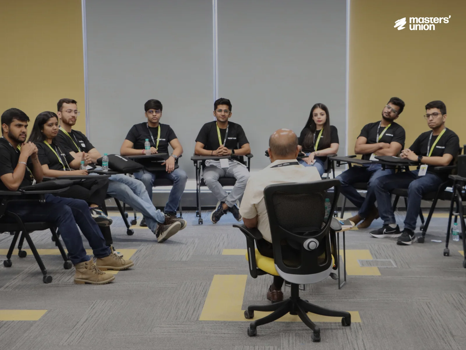
  25. Photo: a group discussion
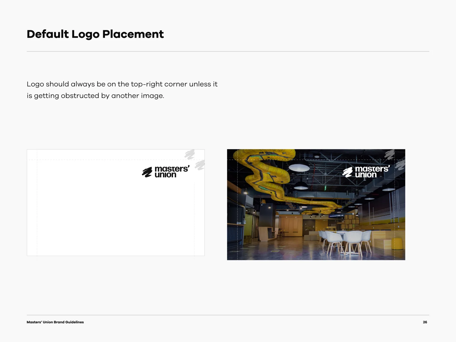
  26. Default logo placement
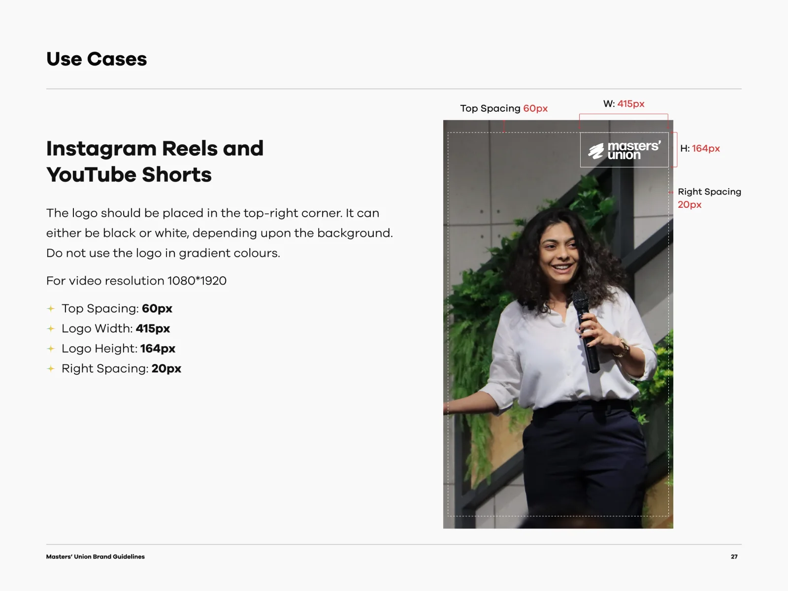
  27. Use case: Instagram Reels and YouTube Shorts
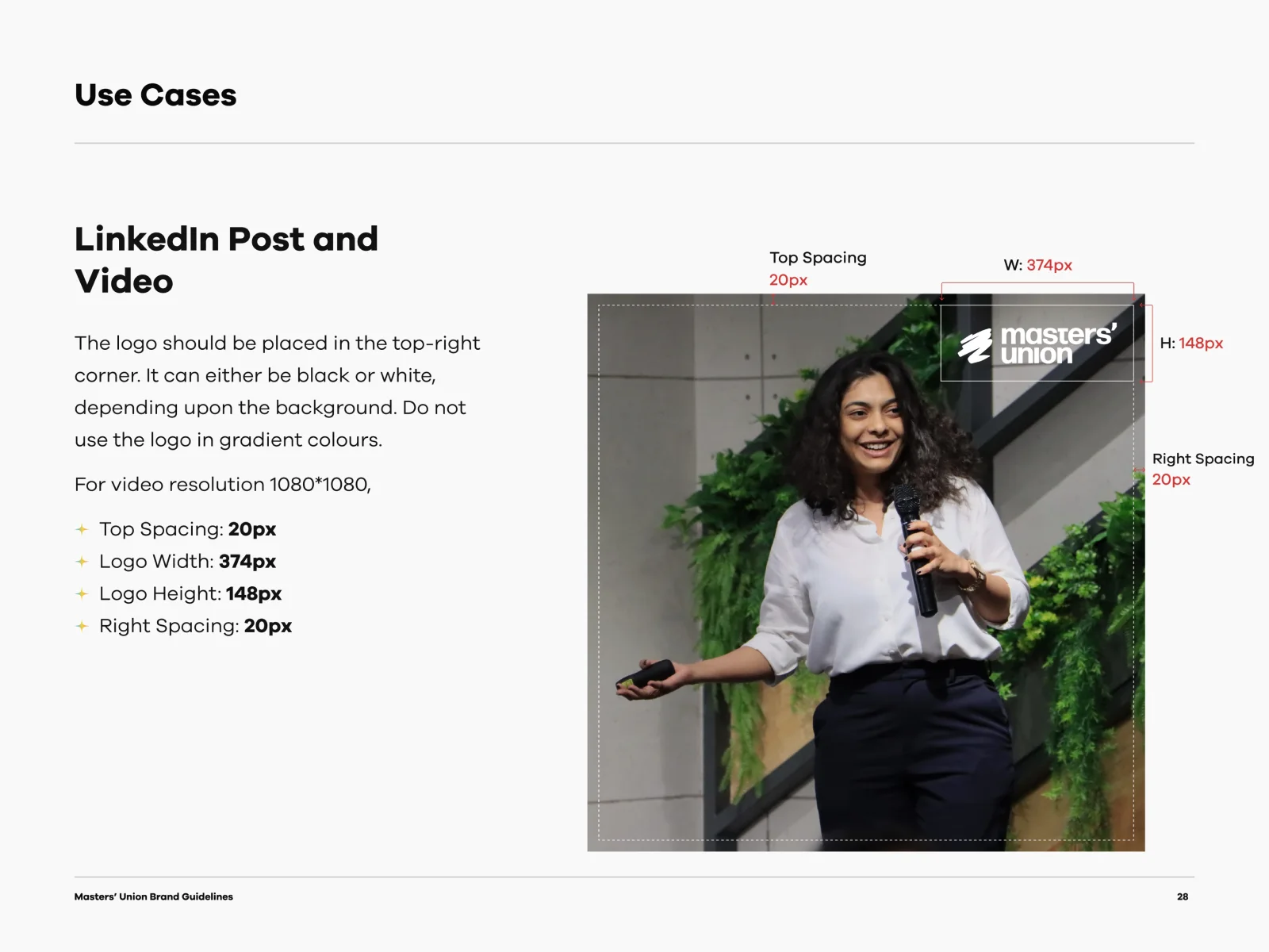
  28. Use case: LinkedIn post and video
  29. Use case: YouTube podcast
  30. Use case: static post and carousel
  31. Use case: e-mail signatures
  32. Use case: letterhead
  33. Use case: envelope
  34. Use case: ID cards
  35. Photo: the Masters’ Union team

Information architecture

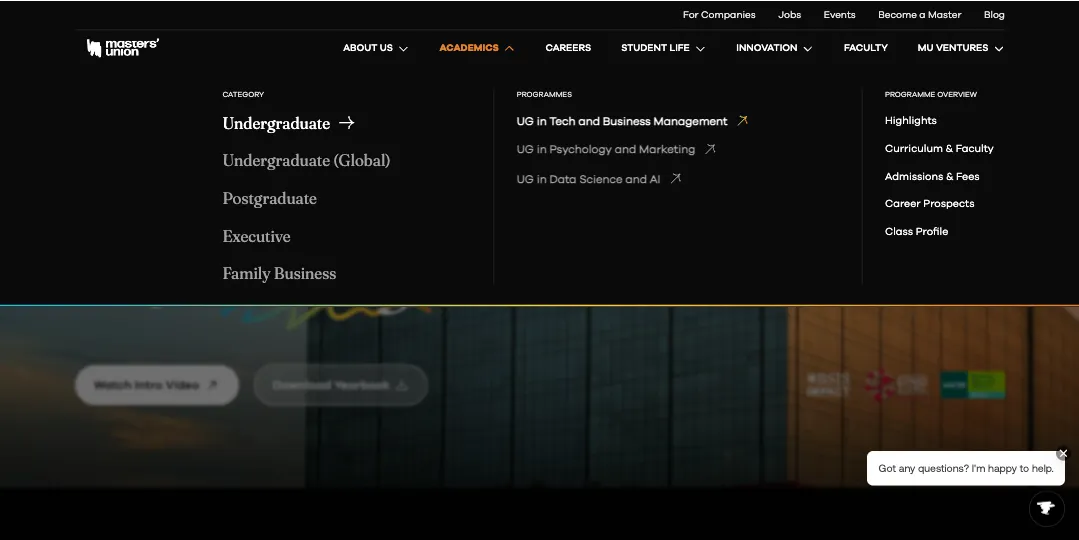
Simplified navigation for faster discovery

We restructured the entire information architecture by grouping pages based on user intent rather than internal hierarchies. This makes it easier for users to find programs, understand offerings and move across sections without confusion.

Why this improves UX

  • Reduces cognitive load and eliminates hierarchy fatigue
  • Makes all programs discoverable in 1–2 clicks
  • Supports role-based journeys like Students, Parents, Faculty, Partners
The new Masters’ Union navigation menu, grouped by audience

After

The new program page: 12 decisions

Each number marks one decision on the page, why I made it, and the finding it resolves.

The redesigned Masters' Union program page, full length, with twelve numbered design decisions

Decision 1Lead with the one idea the school owns

Decision Open on “Learn by Doing”, the core USP, in three words.

Why Primacy effect anchors perception early, and a simple phrase is recalled faster.

Decision 2Let leaders and place carry the authority

Decision Show practitioners as faculty, and use the Cyberpark campus as the image.

Why Authority bias lifts trust, and context communicates credibility without text.

Decision 3Earn intent before asking for it

Decision Video is the first CTA, with the yearbook beside it for high-intent users.

Why Emotion first, reason later. Progressive disclosure keeps the ask light.

Trade-off Apply is no longer the first ask in the hero. It moves down to the admissions deadlines (5).

Decision 4Anchor the promise in verifiable numbers

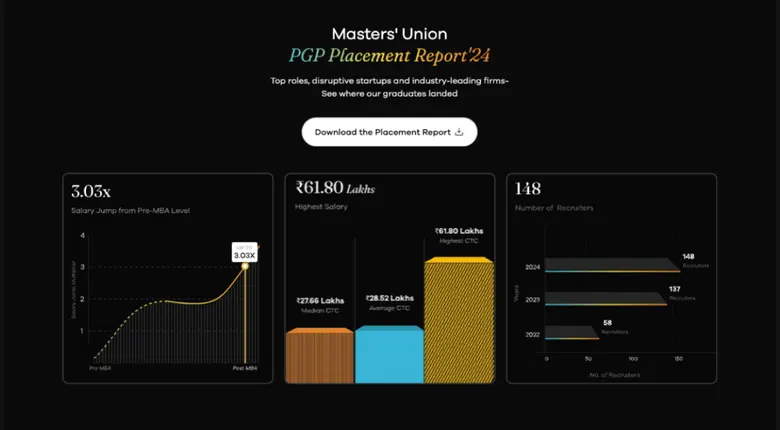
Decision Lead the proof with placement numbers, plus the faces and names behind them.

Why Social proof makes outcomes feel real, numbers reduce doubt, and relatable profiles spark “this could be me”.

Decision 5Put the deadline where the decision happens

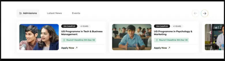
Decision Countdowns and deadlines sit on the program cards, with tabs for programs, news and events.

Why Urgency nudges people to apply now, and tabs hold the rest back until it’s wanted.

Trade-off Urgency only works while deadlines are real, so it is tied to actual admission rounds.

Decision 6One decision at a time to reach a program

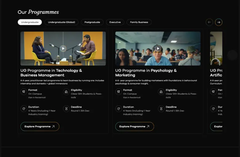
Decision Category tabs, with format, eligibility and deadline upfront on each card. Full details in 1–2 clicks.

Why Hick’s Law: fewer choices at each step, and faster scanning and comparison.

Decision 7Replace claims with proof of real work

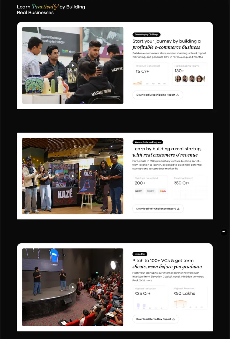
Evidence A/B tests showed users ignored generic copy.

Decision Three tangible journeys, Dropshipping, VIP and Demo Day, each with metrics and video.

Why Chunking removes ambiguity, and proof builds trust faster than promises.

Trade-off Three full sections make the page longer. This is the USP, so it earns the space.

Decision 8Bring campus life into one familiar format

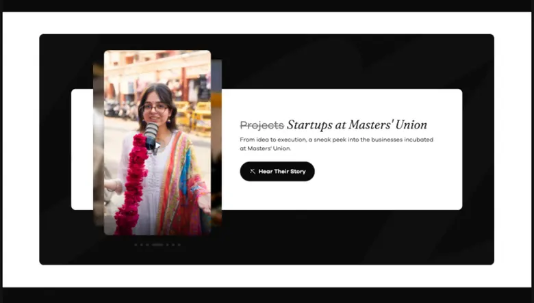
Decision Vertical, edge-to-edge video in an auto-swipe carousel.

Why It uses the Instagram and TikTok habits users already have, which lifts time on page.

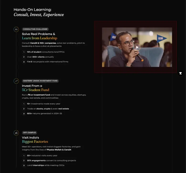
Decision 9Turn a dense list into a guided timeline

Decision A scrolling timeline, with sticky media that swaps to match each step.

Why Linear progression reduces overwhelm, and each action gets context with no extra interaction.

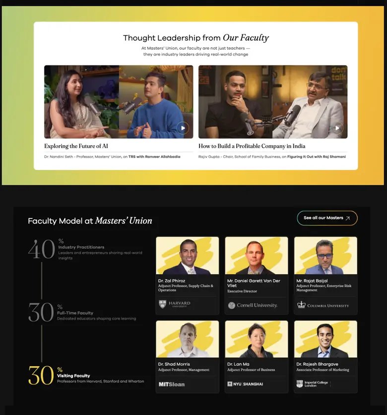
Decision 10Make “who teaches” readable at a glance

Decision Three faculty segments with a percentage share, plus faces and titles.

Why Percentages give a quick mental model, and faces map expertise to real people.

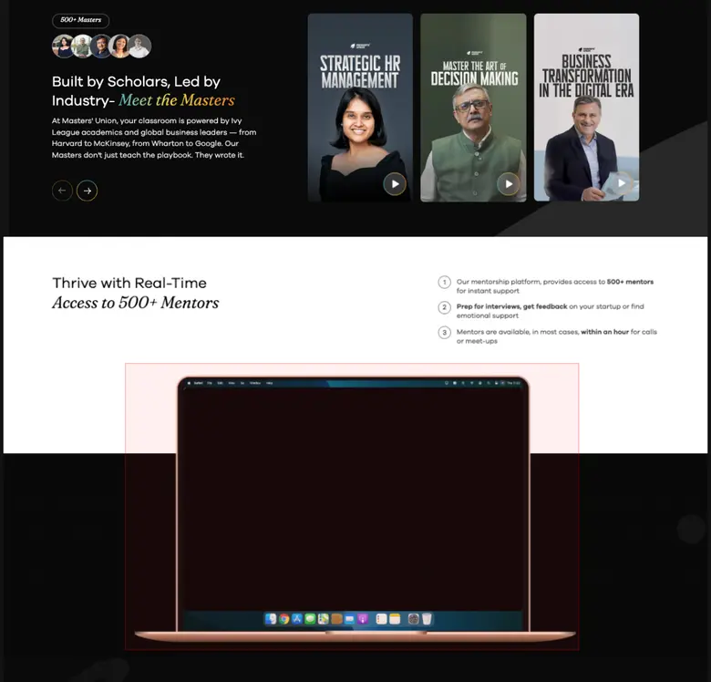
Decision 11Show the platform instead of describing it

Decision A 15-second product walkthrough of the real interface.

Why Motion gives context before reading, so comprehension is faster.
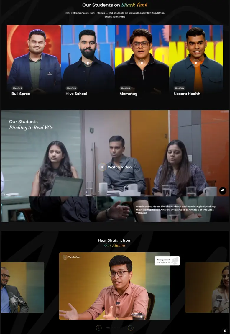
Decision 12Make testimonials feel like a conversation

Decision A large centre video with side cards, in a horizontal scroll.

Why The centre frame holds focus, and the side cards invite continued swiping.

Outcome

What changed

  • The platform grew from a 20-page site to 150+ pages, 10+ programs and 70+ events on one system.
  • Engagement rose 25%.
  • Design became a function with its own system, workflow and 8-person team.

“By the time he left, design wasn’t a function at MU. It was a pillar.”